Clients ask us to help them choose between vendor solutions nearly every day. Once we dig into the organization’s challenges and existing technologies, we can help pretty quickly. We’re asked about Alteryx vs Tableau frequently, so we’ve written up our findings to help you understand the two solutions better.
In the pages of analysis that follow, you’ll find many examples of what each of the tools do well, and where they lack functionality. For those of you with a short attention span, here is a summary:
- Alteryx is fantastic at data access, clean-up, blending, manipulation, Excel process automation, and process documentation.
- Tableau is fantastic at data visualization, dashboards, online consumption, and distribution of information.
Alteryx fetches data (from anywhere), manipulates it, and feeds that data to Tableau, Power BI, Excel, data warehouses (Snowflake, Redshift, Vertica, Azure).
Tableau consumes data from ERP, CRM, Alteryx, Excel, data warehouses (Snowflake, Redshift, Vertica, Azure).
There is some overlap, and the vendors will try to blur the lines. Be careful you don’t buy a screwdriver to pound nails. Just because it’s possible doesn’t mean it’s a good idea.
We Select Alteryx When:
- Data needs to be accessed, integrated, and consolidated from many locations (files, databases, cloud/REST API).
- Data requires clean-up before it can be passed to a business intelligence tool.
- Manual data processes need to be automated and documented.
- Analysts need the power to do complex data mappings and manipulations.
- Analysts need to be able to answer geospatial questions (distances, trade areas, drive times, geocoding).
- Organizations need predictive models built and automated for forecasting or predicting future results, failures, sales, etc.
We Select Tableau When:
- Data needs to be presented visually to a broad audience.
- Data needs to be quickly “sliced and diced” to find anomalies and areas of interest.
- Large groups need to consume data easily with the ability to filter, sort, and analyze.
- Data is needed on maps with dynamic filtering, zooming, and the ability to drill to detail.
Most Organizations Need Alteryx and Tableau
The truth is, most organizations need what Alteryx and Tableau provide. Your organization is completing most of the tasks above manually or with other tools. At Capitalize, we believe that Alteryx and Tableau are best-of-breed technologies that complement each other more than they compete. The right tool for you at the moment is dependent on where you’re experiencing the most pain. If you need help with data processes, Alteryx is a fantastic platform with instant return on investment. If you have your data ready but need help making sense of it and getting it in the hands of the decision-makers, Tableau is an amazing choice.
For those of you looking for a deep dive into the two platforms, we’ve written up a detailed technical analysis of each platform. When you’re ready to discuss and dig further into each solution, please reach out to us, and we can help you figure out, which makes sense for your unique situation.
On with the show!
Alteryx vs. Tableau: Key Areas of Comparison
The purpose of this article is to assist organizations in making informed decisions when looking at one or both products. Details related to the seven core pieces of functionality are found throughout this document, and the purpose of the executive summary to provide a glimpse of conclusions and context into how the analysis was performed by breaking the functionality of each product into comparable categories, then reviewing how the functionality works with highly skilled analysts, who have vast experience with the tools to determine how each product handles the criteria of the category. This exercise was approached with the assumption that we need to cover the gamut of connecting to data sources, through data cleansing, to consuming and visualizing the data. The findings assume that the source is of average complexity and is not optimal for visualization without pre-scrubbing.
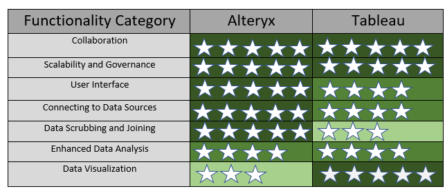
Seven major functional areas used for comparison:
- Collaboration
- Scalability and Governance
- User Interface
- Connecting to Data Sources
- Data Scrubbing and Joining
- Enhanced Data Analysis
- Data Visualization
Executive Summary of Findings
Overall, the findings suggest that when the importance of data analysis relies on the direct manipulation of a data source and less on the aesthetics of the output, Alteryx is generally more effective. If the goal is to provide easy–to–use and interpret output with beautiful visualizations, Tableau is the best choice. However, the power duo of using Alteryx to provide a clean and well-organized data set, then using Tableau for visualizing and slicing-and-dicing the Alteryx data set, gives a user an incredibly comprehensive, robust means of analyzing nearly any combination of complex data.
General recommendations for organizations to consider when deciding if one or both tools is the right solution:
- On a scale of 1-5, how much data manipulation is needed in order to have a well-organized data set?
- 3 or greater probably benefits from Alteryx in order to accomplish what is needed on the data set.
- Is the preference for output interactive visualizations and/or dashboards?
- If “yes,” then Tableau
- Is the preference for output a static file, like XML or Excel?
- If “yes,” then Alteryx
It is important to note that drawing data conclusions from implied results of a data set alone is never advised. Data science is an art, with many moving parts and differing types of expertise that contribute to the analysis of data. The process of creating the analytic output is the first part of the final data masterpiece.
Collaboration, Scale, and Governance: Architecture Overview of Server
Tableau and Alteryx have many add-on features and functionality, but the core architecture of both products have several similarities.
High-Level Commonalities Between the Functionality of Alteryx Server and Tableau Server:
Scheduling of Alteryx Workflows and Tableau Content
Tableau scheduling can accommodate refreshing extracts, running flows, or delivering subscriptions. Alteryx scheduling allows users to schedule a workflow or trigger an Alteryx application.
Easier Collaboration and Dissemination via the Web
If users currently locate reports/workflows by keywords searches in SharePoint or Outlook, the organization and ease of access via the web address will greatly improve collaboration and access to content. Alteryx and Tableau both allow centralization of data, accessible via an organization’s secure network or via the Cloud.
Scalability
Complex workflows/applications (Alteryx) or reports/dashboard/data flows (Tableau) can be processed on centralized, managed and audited servers instead of an individual’s computer. Due to the centralized auditing for performance, the appropriate amount of resources can be allocated towards the processing of Tableau or Alteryx content, making it scalable for as many users as necessary.
Cost
If an organization is looking to give wide-spread access to Tableau or Alteryx, server is a cost-effective way to provide mass access, in a controlled environment.
In addition to centralized server capabilities, both products provide a robust desktop application for development. Both are visually interactive yet provide numerous tools and methods to provide complex and comprehensive data analysis. Details on the commonality and differences in these functionalities are outlined later in this article.

User Interface:
Alteryx Desktop:
In Alteryx, the user interface is consists of a menu bar/toolset, workflow canvas, results window, and configuration window. Each time a user drags a tool onto the canvas, the configuration window is used to customize the properties for the selected tool. To join tools together, a user drags the next tool on the canvas, aligning it with the corresponding path, or creating the path by dragging from the end of the prior step to the new tool. Once the tool is situated on the interface, click on the tools and note the configuration window
Tableau Prep:
The Tableau interface is consists of the connections pane, flow pane, profile pane, and data grid. After connecting to a data source, the user can add an iterative step to the flow plane by clicking on the type of action desired for the next step. This process automatically joins one step of the flow to the next. After running the data flow, the profile pane gives a visual representation of the data, while the data pane shows the actual results.

Tableau Desktop:
Tableau Desktop is consists of cards/shelves, the view or “viz,” data pane, analytics pane, toolbar, data source page, and sheet page. After connecting to the data source, the data in Tableau Desktop is divided into dimensions, which are non-aggregable supportive attributes, and measures, which are aggregated when used. Typically, visualizations are created in Sheets, then Sheet visualizations are added to the Dashboard or Stories. Dimensions or measures can be pulled on the view pane directly or dropped into rows/columns. Users may allow Tableau to choose the visualization type based on the data set or choose a different one under “Show Me.” Additional data context can be added to the visualizations by dropping data onto one of the cards or shelves, providing context such as color changes due tied to a data element, filtering, additional detail, and size of data measure on a visualization.

User Interface – Comparison
Alteryx has a consistent, color-coded, drag-and-drop interface that is easy to recognize and configure. With three main panes for configuring, viewing and design, understanding how to navigate the tool has a short learning curve.
Tableau has two interfaces (Prep and Desktop), which adds complexity, but the flow from design to configuration by dragging and dropping and seeing immediate results in Desktop gains points overall for the user interface.
Winner – It is a tie.
Connecting to Data Sources
In order to evaluate each tool, we’ll review different functionality available in Tableau and Alteryx and determine where each tool shines.
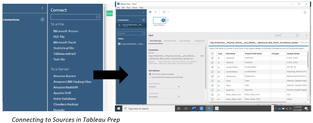
Connecting Data Sources in Alteryx Desktop:
Much of the basic navigation is the same in Alteryx Designer regardless of the specific tool you are using. The color-coded menu at the top of the screen matches the tools that correspond to the menu. Additionally, there is a search bar, which allows users to search for a specific tool.
In order to connect to a data source in Alteryx, a user will drag the “Input Data” tool from the color-coded “In/Out” menu item. After dropping the tool on the interface, the connection is made to a data source by clicking on the drop down circled in the Configuration pane. 
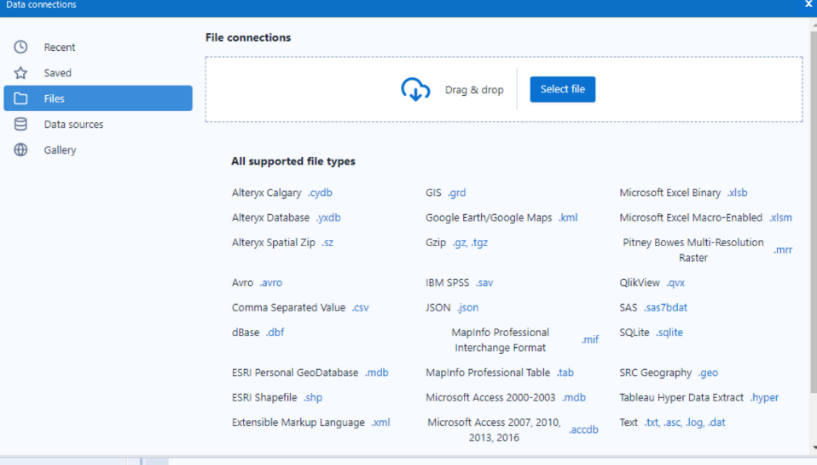
Once inside of the configuration settings, a user may navigate to a directory to choose a file or isolate by a specific data type within a directory by clicking on the data type. Alteryx connects to a wide variety of data sources out-of-the-box, including Alteryx-created files, and more obscure data sources may use standard connections like ODBC.
Connecting Data Sources in Tableau Prep vs Tableau Desktop:
In terms of data preparation, Tableau Prep and Tableau Desktop both connect to a variety of file types, but users may need both Tableau Prep and Tableau Desktop in order to obtain the desired results. Additional considerations related to scrubbing and joining data in Tableau Desktop vs Tableau Prep are in the next section “Data Scrubbing and Joining.” Fundamentally, if the primary goal is to explore, clean, integrate, or reshape data, Tableau Prep is the better option; if the primary goal is to visualize, Tableau Desktop will perform better. 1
Like Alteryx, Tableau has a drag–and–drop interface for connecting data sources, though the connection interface is different from the “Worksheet” and “Dashboard” interfaces.
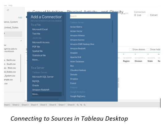
Connecting Data Sources – Comparison
Connecting to data sources in both tools is easy and intuitive. With Tableau, there are two potential applications in their suite involved, adding some complexity to the process. Also, there are limitations on the types of data sources allowed in Tableau Prep.
Alteryx provides no limitations on data source connections and the interface provides consistency of icons and process throughout the entire toolset.
Winner – Alteryx
Basic Data Scrubbing and Joining
An essential part of ultimately visualizing data is creating a data source that allows for efficient rendering of data and contains all the desired, scrubbed data elements. This means that the data needs to be concise and clean, which can have limitless implications, but generally include the following characteristics:
- Complex data calculations, which could affect dashboard or application performance
- Data type changes
- Nulls and blanks properly handled
- Filtering
- Data sources join/union
In order to illustrate the similarities and differences, we will specifically preview the Join and Filter tools in Alteryx and Tableau, and touch on the common functionality used in basic data scrubbing and joining.
One may ask, “Why would I use the filter tool on the data source instead of applying the filter directly to a visualization?” Generally, this is related to performance, optimization, and audience. For example, in our data set, there are a small number of records that were null or blanks. As our data sets become more complex, the nulls may become problematic; thus, it would be best to have them eliminated in the data set.
In some data sets, filtering the data may be necessary to remove duplicate rows, caused by an inconsistency between two disparate data sets. This sort of situation could result in a substantially smaller data set that will perform much faster if addressed pre-visualization tool. In other data sources, filtering the data set as a user works through visualizing, may work well.
Alteryx Desktop:
At a high level, Alteryx has tools that assist data organization with preparing, joining, parsing, and transforming. In total, Alteryx boasts over 200 individual tools that can be used to organize data better. Some of the commonly used tools include:
Output
Users identify a file or directory for the end of a data flow
Browse
View and analyze data without leaving Alteryx, by using the tool to view the contents of whatever data flow you have created (maps, snippets, lists)
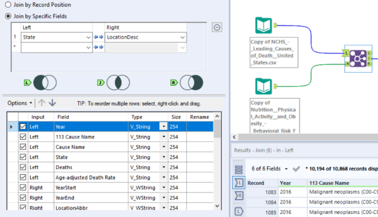
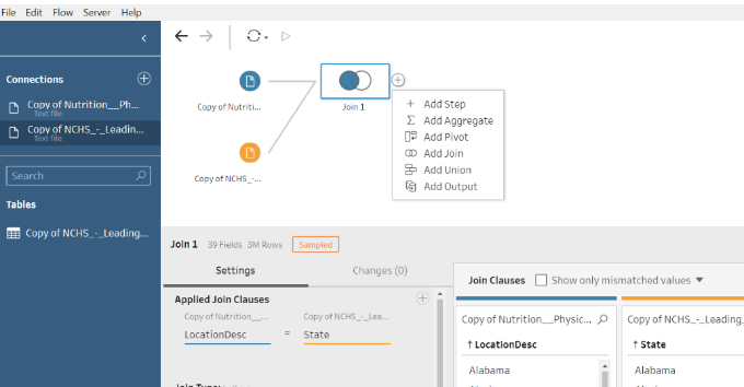
Join
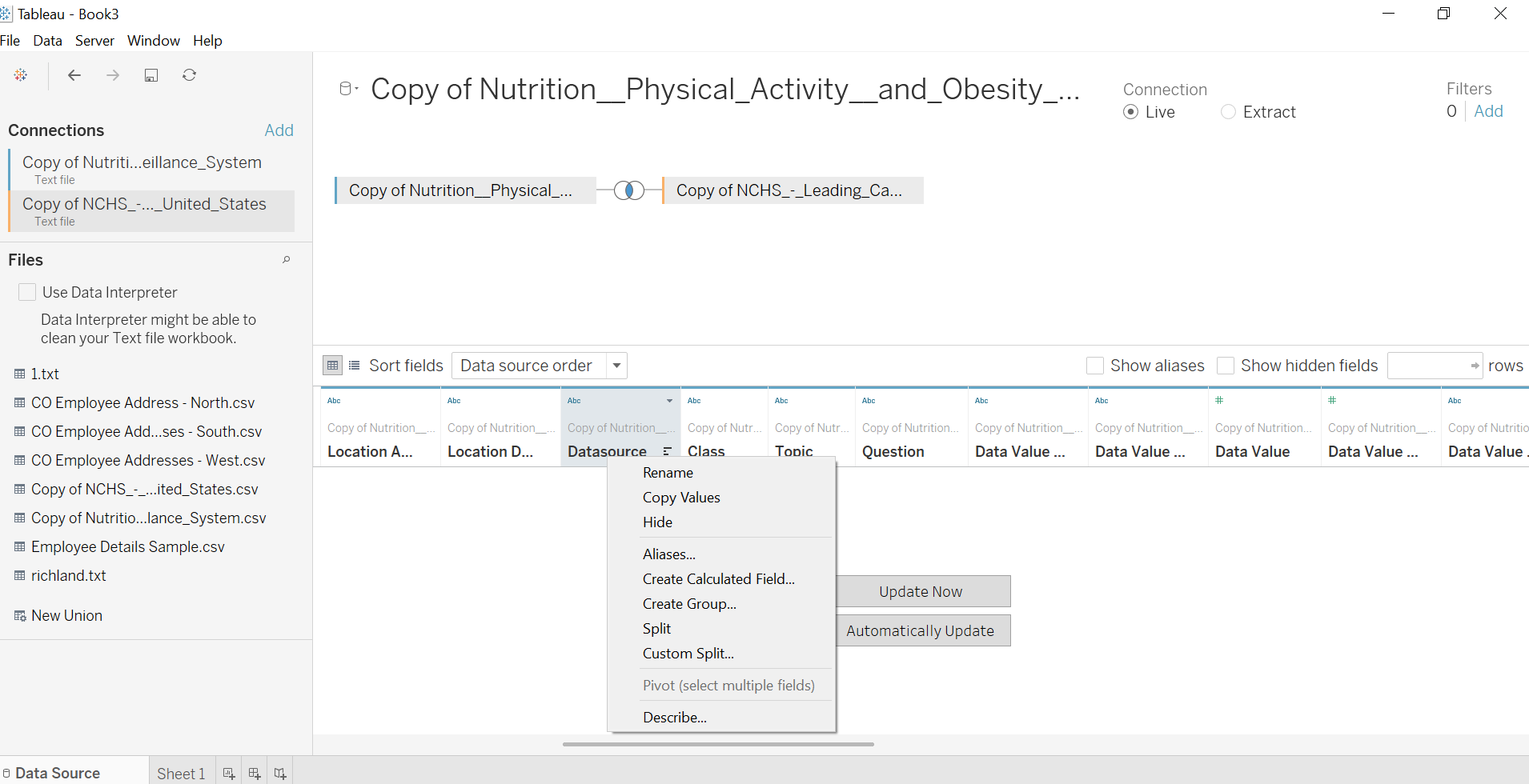
The Join tool allows users to connect two disparate sources together by either data position or data item name, allowing for additional flexibility from a standard SQL join. A Join will add columns to a row, containing the data elements from each data source.
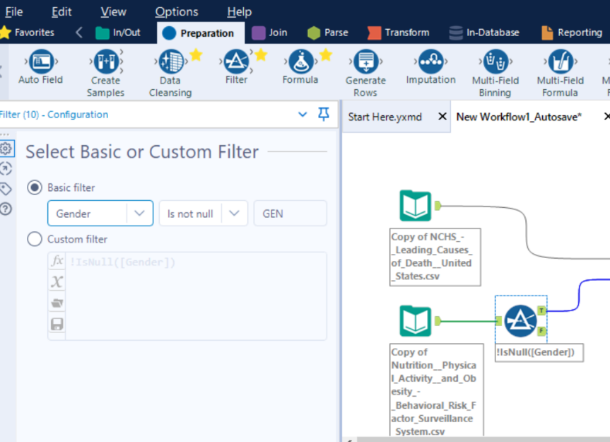
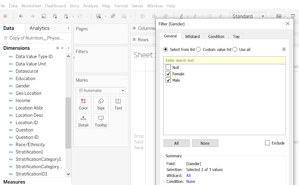
Filter
The Filter tool is part of the Preparation menu. The user can choose the appropriate options such as data item and definition for the filter or can create a custom filter if the condition is more complex.
Union
Like the Join tool, Union allows users to join two data sources by either name or position. Unions will add rows, providing the same column titles for both data sources.
Transpose
Transpose reorganizes a less-than-optimal data source. For example, if we have sales by product organized for each month of the year in one row, attempting to analyze that data in a meaningful way year-by-year is challenging. Transpose will pivot this data set, providing a row for each product, month, and year. This will vastly increase the ways we can slice –and dice the data.
Crosstab
The Crosstab tool is essentially the opposite of the Transpose Tool. For example, let’s say our data set contains all Presidents and Vice Presidents with relevant details, with a column that designates if the person is the president or the vice president. It would be more efficient to analyze this data by having the President and Vice President on the same row, instead of breaking into a new column.
Text to Column
Often, data sources contain important and discerning information in one column. A data set may have address information in one field, separated by a column (address line 1, address line 2, city, state, ZIP). Text to Column allows a user to parse the data into different columns, based on an identifying factor (in this case, a comma). This allows analysis on each component of an address.
RegEx
Sometimes, the evaluation of a data item is to determine if it meets certain criteria or not. In the previous example, we can use RegEx to determine if the ZIP code is missing for a customer and identify each row as True or False.
Comment
The Comment tool allows the creator of the data flow to have text boxes that explain additional context to the data flow. This enables anyone to open the workflow and understand exactly what is occurring, without having to open any of the tool configurations.
Weighted Average
The Weighted Average tool calculates the weighted average of an incoming data field. A weighted average is like a common average, but instead of all records contributing equally to the average, “weight” means some records contribute more than others. There are several Alteryx tools that accomplish complex mathematical problems, with minimal effort on the data flow creator.
Tableau Prep and Tableau Desktop:
There is considerable overlap in functionality between Tableau Prep and Tableau Desktop. Generally, Tableau Prep should be considered when the emphasis of analysis is on the organization of the data; if the data is well-organized, Tableau Prep may not be necessary for Tableau Desktop visualizations. If data reorganization at the source level will improve overall analysis, or improve the speed in which your results render, Tableau Prep is useful as a first step. In other words, sometimes, creating joins, calculations, aggregations in Tableau Desktop visualizations will perform nicely; other times, it is necessary to pre-scrub for optimization. Certain tasks, like pivoting, are more difficult if not impossible to accomplish in Tableau Desktop alone.
Tableau Prep allows users to perform data preparation on files and against servers, and includes functionality such as:
Joining Data Sets
Create inner or outer joins based on data item names, or union data sets.
Adding Calculations
Users may enter a formula to create a new column or choose a commonly used function as a starting point for a custom calculation. Let’s say you have an accounting data set, with debits, credits, and object types. A calculation in the source file could provide balance, based on object type, that would eliminate the need to create custom calculations when creating visualizations in Tableau Desktop.
Creating Aggregations
A new calculation may be created for a custom aggregation, by choosing an aggregation type and field. For example, this would be useful to have already aggregated in our data source if our end goal is to identify average test scores by demographic type by year.
Adding Pivots
Pivoting allows a user to reorganize data to rows or columns in a manner that is best for analyzing a data set. For example, a data set that contains budget and actuals data with each month identified on a single row would be better analyzed if the account codes were broken out, so each month was identified on a new row.
Insights
As a user trying to analyze data, potentially unsure of what changes are impactful or how those changes will affect the output, “Insights,” designated by the lightbulb, will give specific examples of how a tool will affect the specific data item the user is previewing.
Notably, neither Tableau Prep nor Tableau Desktop allow users to perform the following Basic Joining and Data Preparation functions that exist in Alteryx:
Sampling
Sampling is related to a variety of tools, and it allows the data flow to only pull in a certain number, percentage, random sample. This is useful for very large data sets to understand trends and is also important for the beginning phases of predictive analytics.
Tiles
The Tile tool groups data sets by assigning a value (tile) based on ranges in the data. This tool is particularly helpful when looking to group-specific values, in order to provide a minimized result set.
RegEx
RegEx allows a user to parse out certain pieces of a string and provides a Boolean value if the components are found. This is very helpful in looking for data anomalies in a column and can allow for a corrective course of action when found.
XML output
Weighted Average
Cache results for optimal performance
In terms of Basic Data Preparation and Joining, Tableau Desktop allows users to perform data preparation on files, databases, and against servers. Notably, anything preparation-related is occurring at the visualization level in Tableau Desktop:
Joining Data Sets
Create inner or outer joins based on data item names, or union data sets.
Modifying Properties of Visualizations
Users can change the colors, control the size of components of the visualizations, add tooltips, change the level of detail, and add labels to vastly change the appearance of the visualization. The level and depth of detail this provides allows users to hover and isolate specific data sets.
Filter Data
There are several ways to filter data, from choosing data for inclusion/exclusion from a drop-down list, applying wildcards, performing top/bottom evaluations, or a custom expression.
Sort Data
Create Data Groups and Data Sets
Grouping and creating data sets is an efficient way of isolating certain data that is skewing a visualization. For example, in a data set containing student registration data across a year, we may notice that fall and winter are very low in numbers, where spring and summer are high. Instead of having a data set with 12 months, 6 months with very low detail, we could group the low-performing 6 months into a group called “Off-peak.” This way, the visualization would clearly identify the 6 months of high performance, and the other 6 months would also be represented.
Creating Calculations
There are three different types of calculations that are available to provide several ways to create calculations. Simple Calculations, such as determining balance from actuals and encumbrances from the budget, can be created by using the pre-defined function set or typing the functions, if known. Level of Detail and Table Calculations allow for more granularity in aggregation expressions and other kinds of calculations. For example, a Table Calculation may be used to derive a column that parses out an author’s last name from a field containing first and last name. A Level of Detail calculation might be used to aggregate the number of best sellers each author has written in the last five years.
Basic Data Scrubbing and Joining – Comparison
With complicated data sets that require additional effort to enable them to be analysis-ready, Alteryx has more robust capabilities than Tableau. The mathematical functions, documenting capability, and parsing functionality allow Alteryx users to create data flows that are complex in nature, but simple to build. Additionally, Tableau has two products that contribute to data cleansing and joining, while Alteryx can accomplish data cleaning in one, easy-to-follow application.
Winner – Alteryx
Enhanced Analysis of Data
Beyond creating an efficient, well-organized data source, a major of the power of tools like Alteryx and Tableau is taking the squeaky-clean data source to the next level by applying predictive components, trend lines, creating applications to further create efficiency, and generally providing different data perspectives that tell a compelling data story.
Alteryx Desktop:
To In terms of enhanced analysis and data preparation, Alteryx provides functionality like:
Fuzzy Matching
Let’s say you have two data sources, containing employees’ names. In one data source, the name is “John Smith” and in the other it is “Johnny Smith.” Fuzzy matching allows users to match data based on minor discrepancies, as appropriate. This is a very sophisticated feature.
Generate Rows
Hypothetically, we have a data set containing account details for the sales team, with one sales team member assigned to each account. A new policy dictates that we have a primary and a secondary sales member assigned to each account. This tool allows the user to dictate the rules in which to replicate certain rows into the new data set, where we could tie the next sales representative to the account.
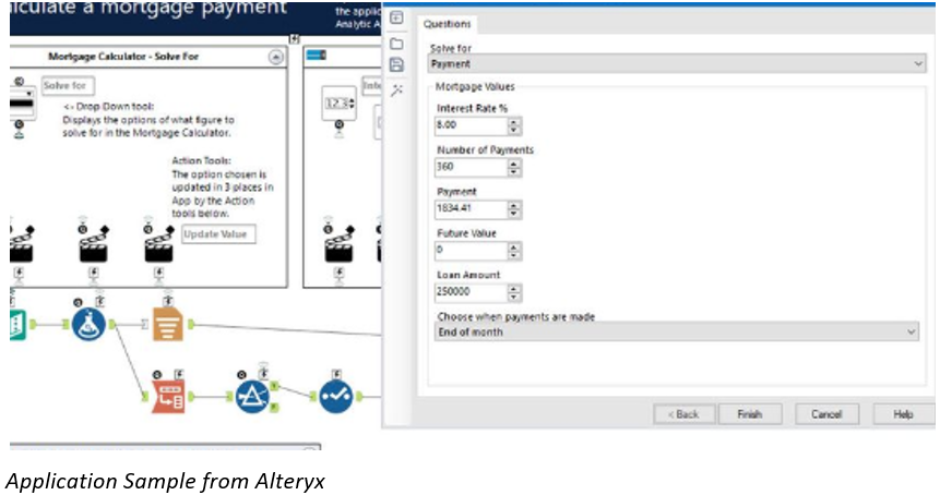
Application Development
Sometimes, obtaining data from a database doesn’t quite match reality. For example, maybe there is a significant time issue when a vendor would be entered into an ERP system, or perhaps the ERP system doesn’t capture a piece of data that is important for the trends we are trying to capture. In this case, developing a front-end application, where a user completes it per instruction, then that data is appended to a data source used for analysis, would provide a quick and easy way of getting exactly what we need.
Predictive Modeling
Using R to provide a means of statistical computing and graphics, Alteryx can use several different options of providing specific methodology that fit your needs. We can use tools like linear regression or decision trees to determine what future sales forecasts look like, based on past performance indicators.
Geospatial Analysis
Alteryx connects to geospatial entities such as US Census and TomTom to give exact attributes based on certain location characteristics. This ability to create specific longitude/latitude points on a given location and create visualizations that show the contextual data on a map provides robust context to geospatial data. Users can view the data on the map inside of Alteryx Desktop or can view the raw data output.
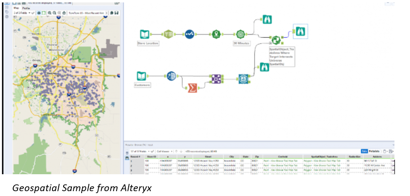
Tableau Desktop:
Like Alteryx Desktop, Tableau Desktop has a plethora of enhanced means of analytics. It works primarily by illustrating stunning graphical representations of data. Some of the popular ones include:
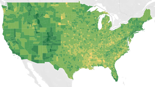
Geospatial Analysis
Tableau Desktop provides a rich and easy-to-configure view into geospatial information that provides 16 levels of zoom, by integrating into R, GIS, or a custom geocoding data source.

Forecasting and Trend Lines
If a user has a data source from a relational database containing a date or integer and a measure, the exponential smoothing technique that creates forecasting shadows is an effective way of predicting future data based on historical patterns. For example, forecasting can add additional flavor to a sales report, so we can anticipate future sales for a given region. Trend lines are another visually pleasing method of displaying illustrating the trend of the underlying patterns.

Statistical Modeling and Predictive Analysis
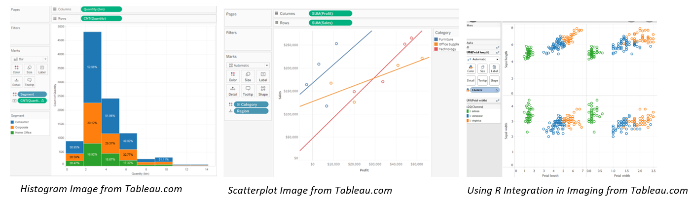
While this topic has overlap with the next section (Visualization), R integration coupled with Tableau’s interface provides the power of complex statistical analysis calculations and visual analysis into one powerful combination. R is not integrated out-of-the-box, but may be added via scripting, and used in conjunction with the built-in visualization functionality of Tableau. Scatterplots and histograms are two very popular Tableau visualization types that are used in conjunction with statistical modeling principal and predictive analysis.
Enhanced Analysis of Data – Comparison
For this exercise of comparison, let’s focus on two heavy areas – geospatial and predictive analysis. Alteryx and Tableau both have comprehensive means of connecting and decoding geospatial data. While Alteryx can connect to a variety of geospatial tools and derive the exact node, Tableau provides an enhanced layer of geocoding by understanding regions and states and identifying the data on a map. On predictive analysis, Alteryx has dozens of tools that will provide exact statistical method of understanding data, but limited ways of viewing the output. Tableau can connect to R and provide a limited amount of statistical analysis with inherent functionality but can visually demonstrate these complex ideas in a way that Alteryx cannot. Alteryx receives bonus points for the application development, which Tableau does not have.
Winner – It depends on what the user is trying to accomplish.
Visualizing Data
Most users will use the prior steps discussed – scrubbing, enhancing, joining data – to get to the end, which is enabling the data to be consumed easily.
Alteryx Desktop:
- Alteryx provides an easy way, via the Browse tool, to view the output of data. This is particularly helpful when a user is in the cleaning phase of dealing with data, as the user can see the data, metadata, and quality of the data set, which could indicate to a user that further cleanup is needed.
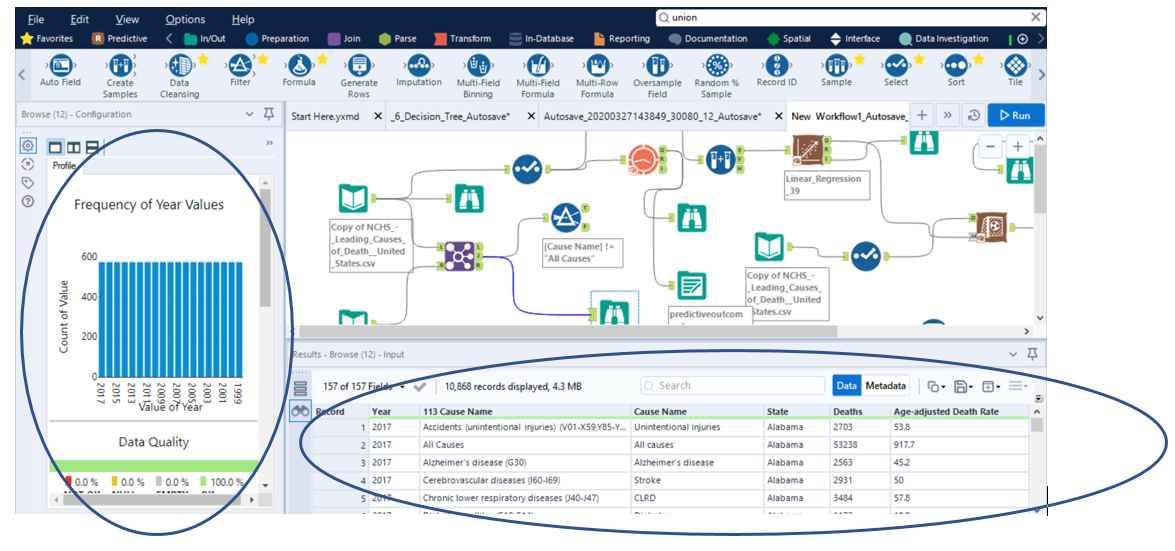
- Other reporting options exist in Alteryx that allow users to view commonly used visualizations, such as charts and maps in the Browse output.
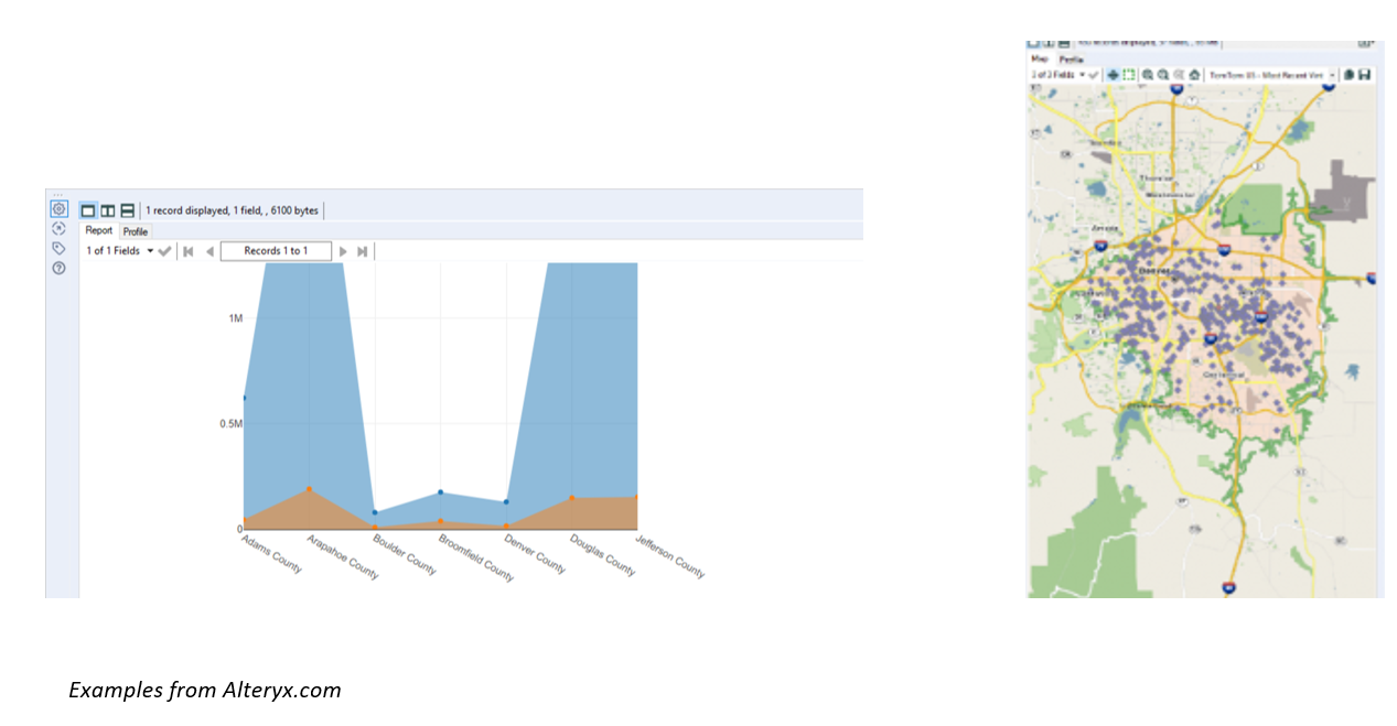
Tableau Desktop:
- Tableau Desktop provides a wide variety of visualizations that can be customized to fit any data output need. Users can switch visualizations or details “on-the-fly” if the visualization doesn’t suit the need for the moment. A few examples of visualizations:
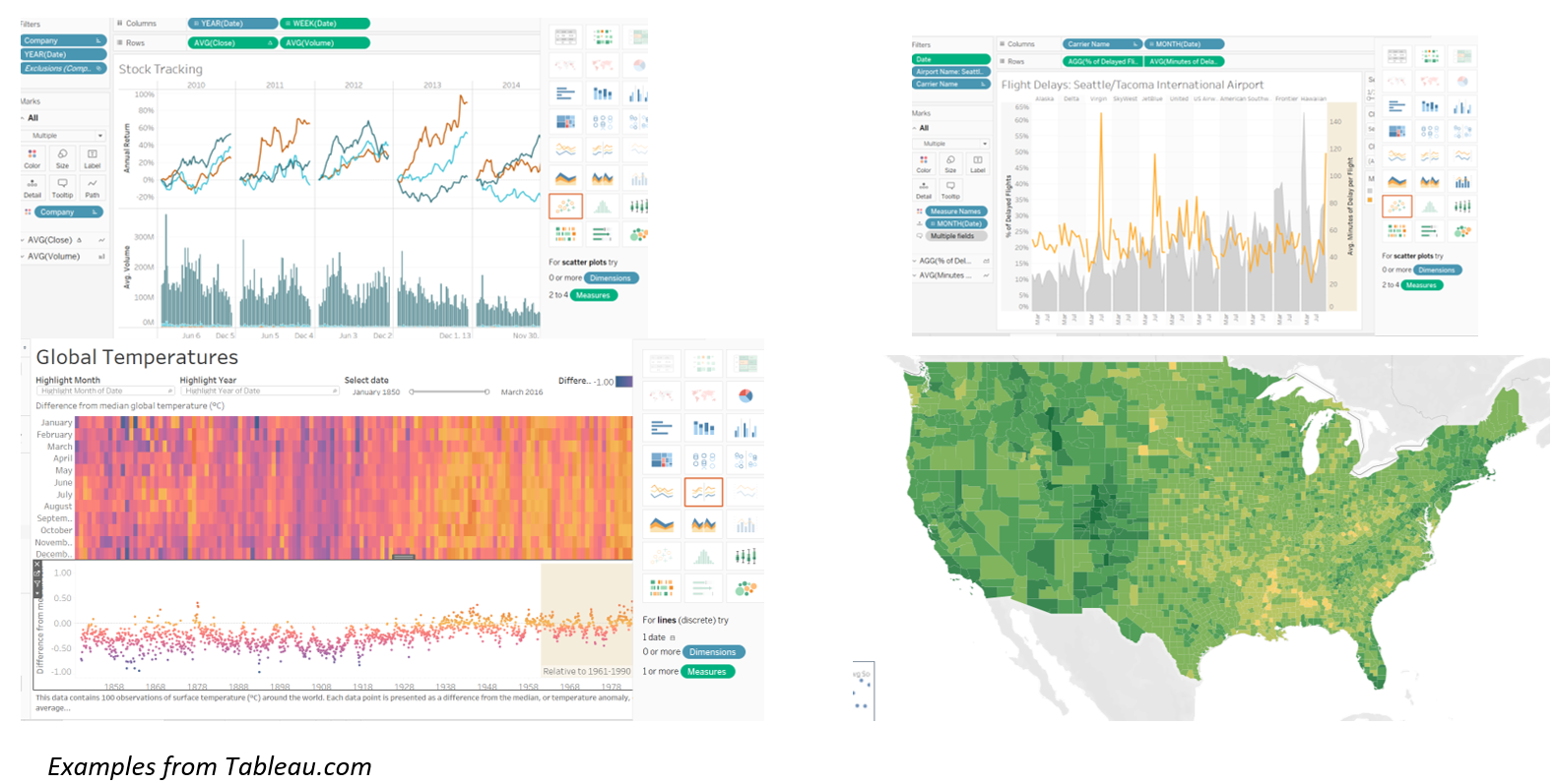
- Once the visualizations have been perfected, they can be added to a comprehensive dashboard. The views may interact, and filter together, as defined by the creator. Dashboards typically must be experienced real-time in order to see the speed and power in which they can consume, evaluate, and return results.

Visualizing Data – Comparison
While both products allow for the ability to view data, Alteryx is particularly good at viewing data as it flows through a potentially complex data stream, in order to get to a final output. Tableau is designed for stunning, powerful visualizations that allow users to interact with the output in an artful, meaningful way.
Winner – Tableau
Overall Conclusions
Though there is overlap in functionality, most users can find benefit in using Alteryx and Tableau together because there are clear delineations in strengths and weaknesses in the products, depending on where the user is in the development cycle. Generally, Alteryx will provide a much broader set of tools to clean a data set and provides a data flow that a user can run to output to a file/directory. It also provides means of data entry, from input via text file to application input. However, the graphical output is limited. On the other hand, Tableau provides a limited amount of data scrubbing capability, so if the data set is complicated, Tableau alone may not be the solution for cleaning the data source, but the Tableau graphics are stunning and responsive.
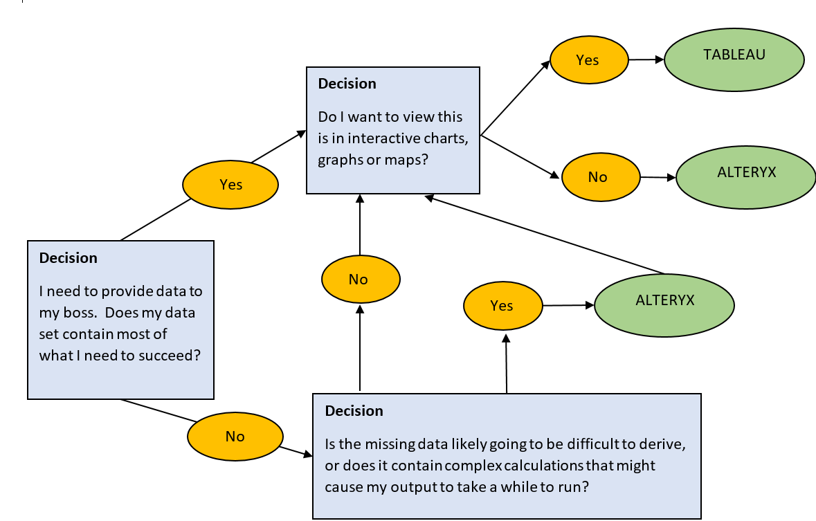
The clear path between Alteryx and Tableau may be apparent to a user immediately, depending on the use case he/she is trying to solve. The solution may also be a combination of the two. If a user has a messy data set, with a combination of sources that need a lot of attention, but ultimately would love to see the end result in a professional visualization, the answer may be to scrub and create a data source in Alteryx, then use Tableau to present the data. This scenario is where the products shine well together.
Below is an example of a simplified decision tree that a user may need to exercise when determining which product (or combination thereof) will best solve his/her data dilemma.
Appendix:
- Should I use Tableau Prep or Tableau Desktop for Data Preparation? https://www.tableau.com/about/blog/2018/7/should-i-use-tableau-prep-or-desktop-data-prep-answer-why-not-both-90902