Cognos Dashboards and Active Reports are both powerful tools that can be utilized for highlighting KPI’s and showcasing relationships between data items in a visual manner. Determining which one to use will depend on, amongst other things, the sources you intend to pull from and the intended end users of the active report/dashboard. Here we’ll discuss the differences and similarities between the two Cognos applications.
User interface:
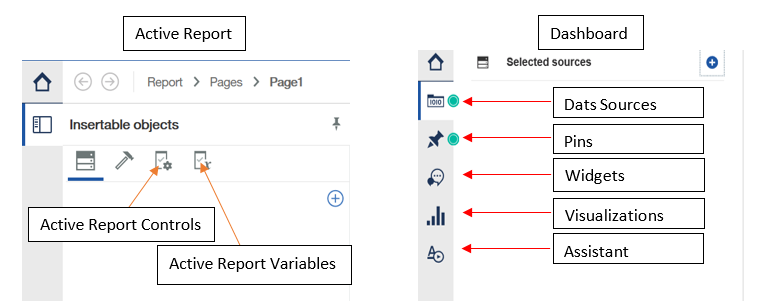
Active Reports
As probably evident from the name, the interface for Active Reports is very similar to a regular Report in Cognos. In addition to the usual Sources and Toolbox tabs, there’s an Active Report Controls tab and an Active Report Variables tab. These additional tabs are what allow the report to have interactive capabilities.
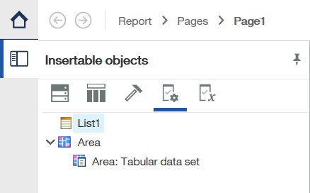
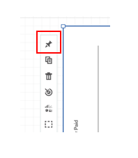
Active Report Controls let you readily access the components of your report to create the desired layout, as well as filter and sort your data.
Connections can be made between items in the Active Report Controls tab by right-clicking and selecting add connection. The Create a Connection window opens:
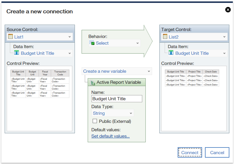
Here, connections can be made between the objects in the Active Report to facilitate interactivity. This window also allows for a Behavior to be set, which controls what action is taken in the Target Control when certain parts of the Source Control are selected.
Active Report Variables are the means by which information gets passed to the controls as well as from one control to another. These variables essentially tie different parts of the report together, allowing them to react to changes in one another. For example, selecting an item in one active control can force another active report to show information pertaining to the selected item.
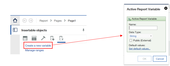
In the Active Report Variable window, you can name and select the data type of the variable, as well as set it as a public variable. This option allows for variables to communicate with one another in other Cognos products, which is key to an Active Reports interactivity.
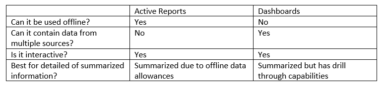
Overall, Active Reports have all the same capabilities you know and love about a normal Report. If your analysis ever requires offline use, Active Reports are the way to go as a subset of the data is internally stored. This might limit the capabilities of an Active Report depending on the size of the data source in use. Existing Reports can also be converted to Active Reports using the Convert to Active Report option in the File menu.
Dashboards
Dashboards in Cognos are great for visualizing key aspects in your data as well as highlighting relationships between sources. The interface consists of the following tabs:
![]() Sources: Add one or more sources to your dashboard, navigate between data items, and add navigation paths (like a hierarchy) within the data to drill down.
Sources: Add one or more sources to your dashboard, navigate between data items, and add navigation paths (like a hierarchy) within the data to drill down.
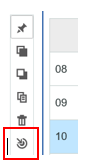
![]() Pins: Store visualization for easy access. To pin a visualization, click the pin icon on the toolbar of the viz.
Pins: Store visualization for easy access. To pin a visualization, click the pin icon on the toolbar of the viz.
![]() Assistant: Explore the contents of your data or type commands to have the assistant show you certain components/ visualizations. For example, typing “show sales by region” will return the appropriate plot given your data source.
Assistant: Explore the contents of your data or type commands to have the assistant show you certain components/ visualizations. For example, typing “show sales by region” will return the appropriate plot given your data source.
![]() Visualizations: Visualize key aspects of the data source using one or more of the available visualizations.
Visualizations: Visualize key aspects of the data source using one or more of the available visualizations.
![]() Widget: Allows you to insert text items, images, media, webpages, and shapes to your dashboard.
Widget: Allows you to insert text items, images, media, webpages, and shapes to your dashboard.
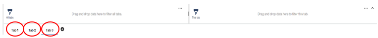
Alongside allowing for multiple data sources, more than one tab can be utilized within a dashboard.
Items can be inserted directly into a tab by dragging and dropping specific visualizations or multi-selecting data items from the Sources tab and dragging those to the workspace. A visualization that best fits the selected data will be automatically created in the workspace.
Directly above the Tab panel sits the option to filter your dashboard. You can add tab-specific filters as well as filters that apply to all the tabs in the dashboard.
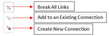
Creating Connections: Much like in Active Reports, objects within a dashboard can be connected such that one updates depending on the selections made within another. The View Widget Connections ![]() tab lets you maintain these relationships with the following toolbar:
tab lets you maintain these relationships with the following toolbar:
Once a connection exists between visualizations, a filter icon will appear on the top left corner of the viz. Drill Throughs are also available within the visualizations. By clicking the drill through icon on a viz you can create drill through to an existing report. This makes a dashboard useful for clients that want to be able to see the summarized information alongside the more detailed report, if desired.
Overall, dashboards are useful if your analysis is visualization heavy. The interactivity and drill through capabilities make it user friendly while the Assistant tab makes it developer friendly. Unlike Active Reports, Dashboards cannot be consumed offline.
What are the main differences?
For more information, contact sales@capitalizeconsulting.com.