Visualizations are eye-catching when first created. However, once the glamour has worn off, a well-designed dashboard will continue to be used by decision-makers. Below are some Cognos analytics dashboard design tips to give your dashboard a long life.
https://capitalizeconsulting.com/the-differences-between-a-cognos-dashboard-and-an-active-report/
Dashboarding Terminology
- Widget: Any item on a dashboard, including shapes, visualizations, summaries, prompts, etc.
- Widget Group: Widgets grouped for focused prompting and filtering.
- Visualization: A chart/graph widget.
- Summary Widget: A single value widget that shows a summary of a measure.
- Value: Measure used in a widget. Can be referred to as length, or size, etc. in the User Interface.
- Category: Attribute used in a widget. Can be called color, bars, sections, etc. in the User Interface.
Dashboard & Data Best Practices
Data Sets and Data Modules
Dashboards run faster from data sets than packages. It is better to create a data set form the package and schedule it to refresh on a daily/hourly basis. Create the dashboard on the data set or create a data module from the data set.
Data Items Names
Name things you want to be displayed on the dashboard in the data module or in a dashboard calculation. As of 11.1, you can’t rename data items in dashboards yet.
Save Calculations for Dashboard/Data Module
If there are calculations in your package, recreate them in the dashboard/data module. If you copy them over to the data set, you can’t recalculate based on filtered data.
Measure Groups
Divide measures like experience and salary into groups to be used as categories. Be sure to keep the original measure in the data module as well so you can use it as a value.
Visualization Best Practices
Storytelling with data
Figure out what type of story this dashboard will be telling. Decision makers typically find dashboards with a consistent message to be more easily digestible.
Dashboard stories can usually be divided into one of two categories: “Show Success” or “Find Failure.” A third, less common type is titled “Show Exactly As This Report.”
SHOW SUCCESS
These are the kinds of visualizations you might show at board meetings, use for end-of-year reporting, etc. The audience is usually comprised of decision makers in charge of the fate of a project. This Dashboard should be designed to show improvement since a project was implemented.
Tips for Show Success Dashboards
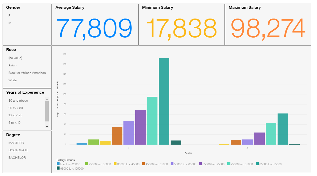
- Larger numbers are more impressive than small ones. “83% Attendance Rate” is more positive than “17% Absence Rate.”
- Ideally, employ a color-coordinated palette with little variation. If possible, use soothing cool colors like blues and greens. Yellow should be the strongest color on this dashboard to highlight the best points. Avoid reds as this color often signifies danger.
- Prompts and filtering should be limited. Larger visualizations look more impressive than multiple visualizations.
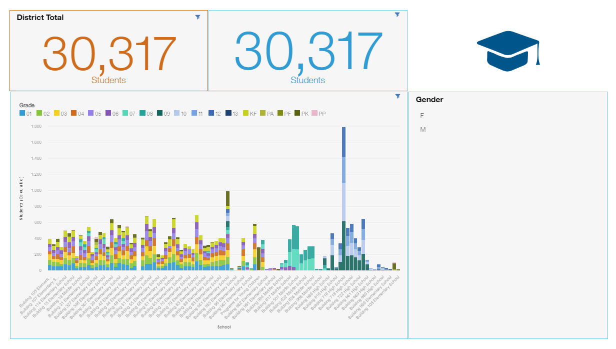
FIND FAILURE
The consumers will use these visualizations themselves to find problems, make decisions, and respond to situations.
Tips for Find Failure Dashboards
- Smaller numbers overall will make larger numbers stand out. For example, an absence rate of under 9%% compared to an absence rate of 13% will catch a decision maker’s eye.
- Not everyone reads visualizations the same way. Show the same data in multiple ways and see which the decision maker likes best for finding issues.
- Use a high-contrast palette. Use red and orange to highlight areas of issue and cool colors for areas of less urgency/importance.
- Offer lots of prompts and filtering options to help narrow down the source of the issue. The more options on a tab, the better.
SHOW EXACTLY AS THIS REPORT
This third type of visualization is more common in a school or government. Government reporting is an amalgamation of formulas and requirements. Some groups find dashboards to be a useful tool to display this collection of information. The decision maker has no control over the story they tell, so they want warning of their story ahead of time. My tip is to try to get a copy of the report you are trying to build a dashboard for and make sure the dashboard best represents that report.
Choosing a Visualization
Avoid using the same visualization repeatedly. A dashboard filled with only bar charts is monotonous. Try to change it up with a column chart or a stacked bar chart instead.
Visualizations for the Data
Choose which visualizations to display your data with care. The below is a sampling of visualization options. There are other types of visualizations available. Google is a good source to figure out how to best use them.
Individual Parts make up the whole
- Pie
- Stacked Bar/Column
- Area
Distribution of Data to find outliers and trends
- Scatter Plot
- Line
- Column
- Bar
Trends over time
- Line
- Heat Map
- Column
Relationships between Measures
- Scatter Plot
- Bubble Chart
Geographic Data
- Map
Other Notes
- Do not use percentage bar charts with data with large ranges. It will inflate the importance of a few individuals.
- Cities do not make good geographic data points unless the area is small, or you are looking at a small number of cities.
- Include a cross tab widget with a map to show the data values in a table.
Reference Visualizations
Use a summary widget, a pie, or a bar chart as a base reference for the entire dashboard. Create a separate widget group for this visualization, so the filtering does not apply to it. As the dashboard user is selecting prompts, this visualization will not change and will remain as a reference point to compare with the filtered data.
Building the visualization
With a Package Data Source, always start with a category, then a filter, and finally the value when building a visualization. Repeating columns and rows can be useful for categories with only a couple of items like Gender or School type.
Formatting a Dashboard
Layouts
When you first create a dashboard, use a predefined layout. They can be limiting at times, but ability to drag a visualization to an area and it snaps to the size of the box leads to a cleaner, more finished look.
Titles and Labels
Do not make assumptions that the dashboard’s audience will know what all the values, axis, and prompts mean. Label everything and label it consistently. Give every visualization a descriptive title. Add a comment to note the scale if necessary.
Example Titles
- [Measure Value] by [Axis 1] and [Axis 2]
- Salary by Location and Year
- Employees by Gender and Experience
- [Axis Measure 1] and [Axis Measure 2] for [Data Point]
- Salary and Experience for Employees
Examples Labels
- Attendance %
- Expenditure $
- Student Population (Thousands)
- Average Unit Price
Sorting
Category Sorting
Sorting a dashboard’s categories is important for color coordination. Ideally, if a category is used in multiple visualizations, each item should be the same color on all visualizations. Sometimes, this won’t work out if one visualization is missing a category.
Time Sorting
Make sure your time categories are sorted properly. School years and fiscal years do not start in January, so you may have to create a calculation for custom sorting.
Backgrounds and Borders
Give a widget a background and border. It gives the dashboard a finished look. Below are a few different design routes when choosing colors for a dashboard.
Color Schemes
Tips Around Color Schemes
Use neutral colors, like black, white, or grey, for backgrounds and borders. We want the data to stand out, not the formatting.
Format Matches Summary Widgets
Use a border color that matches the text color on summary widgets.
Assign each Widget Group a color
If using widget groups, assign each widget group a color to give a visual clue to which visualizations are in which widget group. For example, the orange widget is excluded from the blue widget’s filtering.
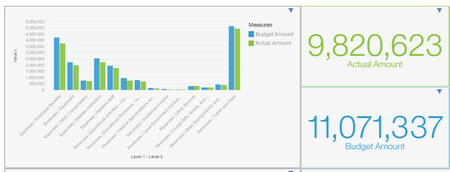
Format Summary to match a corresponding color on a visualization
If there is a summary widget showing a count of international students and international students are green on another visualization, then make the text and board of that visualization green. In the example below, the actual amount is green on the bar chart, so the summary widget is colored the same green.
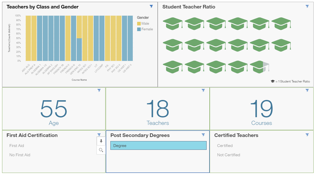
Shape Widgets
Add a shape to summary widgets when the value is easily countable.
Need More Help With Cognos Dashboards?
For more information or assistance creating dashboards, please contact sales@capitalizeconsulting.com.