Almost all companies have processes that are measured and tracked across timespans. The resulting time series data usually exists in large volumes and may detail complex processes which can be difficult to manage, visualize, and analyze. With Alteryx and ABBYY Timeline, users can quickly organize their data and get instant feedback on process performance.
ABBYY Timeline is a process intelligence platform that analyzes trends, durations, and process flows of time series data. With Timeline a user can view the end-to-end processing of transactions and gain insights into process performance. Using the ABBYY Timeline connector tool in Alteryx, users can blend many data sources and send data into Timeline for analysis.
ABBYY Timeline Features
Consider a use case where an online retailer tracks their product sales and delivery. The company logs the dates and times when orders are placed, processed, and delivered. They also record order details such as customer, product, and sales information. Using ABBYY Timeline, this retailer can gain insights into how long it takes to deliver their product into the hands of consumers.
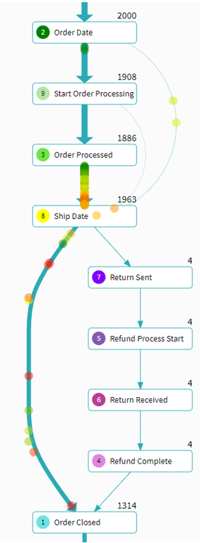
Timeline has built-in tools for visualizing the flow and processing path of time series data. The process schema tool illustrates high-level process flows and individual item processing with animated flow charts. This allows for quick discovery of bottlenecks or irregular processes. For our retailer use case, Figure 1 below depicts a flow chart of the general schema in which transactions are processed. We can see, from the line density, that most online orders are placed, processed, shipped, then the order is marked closed. The figure also shows that many transactions spend much more time in transition between the Order Processed and Ship date. From the figure we can see how most transactions are processed and we can start to understand how much time it takes for transactions to flow between processing states.
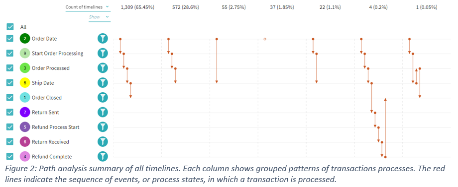
Using the path, interval, or distribution tools you can drill into various transactions and analyze your data at different levels of granularity. Figure 2, below, illustrates that in our retail use case 65% of all transactions follow the expected processing path of order is placed, order is processed internally, then the order is shipped out and marked as closed once delivered. The image also shows other processing sequences that are contained within the data.
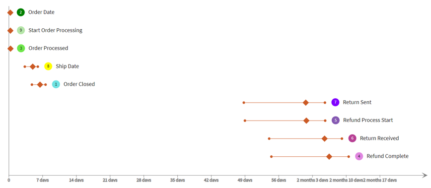
Now that we have looked at the overall processing path and performance, we want to look more closely at each process step individually. In the interval analysis tool, we can see a summary distribution plot that shows the average time in status and the 75% interval. Figure 3 reveals that the statuses with the longest time to complete deal with items that are returned. Transactions that are returned take longer to close because each process step of a return takes longer on average and there is generally a larger time range in which returns are handled.
There is also a forecasting tool that can be used to predict outcomes of transactions when processes are complex or have multiple branches. A model can be configured and trained on initial data so that as more data is read the model can predict outcomes, within a confidence range, of new items.
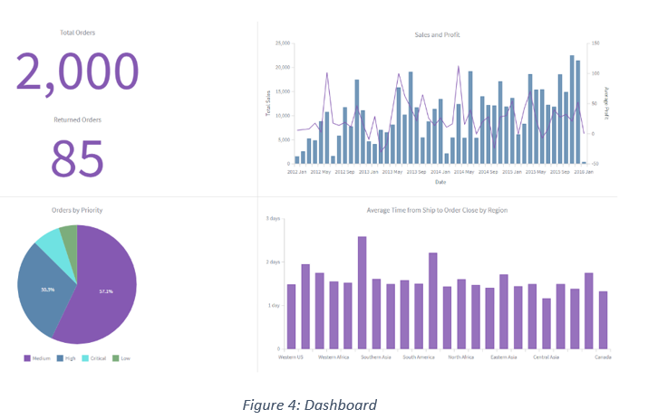
Metrics can be defined to aggregate the data then be used to create KPIs and visualizations in a dashboard. A user can make metrics from counts of items, time intervals, aggregations of attribute values, number of events, or cost. Predefined metrics can be utilized in simple dashboards to provide high-level business insights and to display information on the overall performance of a process. A simple dashboard for our use case, Figure 4, summarizes the number of orders, the number of returns, and the different priority of orders that were within the data set. Two graphs are displayed: one comparing the sales and profits over time, the other breaking down the number of transactions by region.
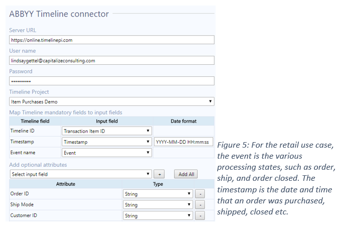
Alteryx Connector Tool
All data that is fed from Alteryx is processed in Timeline, then the tool outputs individual timeline data. This includes the unique ID, start time, finish time, tags, and number of events, as well as number of unique, time duration, average time gap between events, minimum time gap, and maximum time gap. The tool also outputs IDs for any timelines that meet conditions for a predefined alert flag. The final output is a daily aggregation of any predefined metrics. There is an ABBYY Timeline tool that can be used in Alteryx to send and receive data from the Timeline server. The tool input accepts data that is organized with each time series measure as a single record. The tool configuration requires the Timeline server and credentials as well as three mandatory data mapping fields. The input data must have a field that is a unique identifier for the items being processed, which is mapped to the TimelineID. There must also be a date field which will serve as the event Timestamp in the mapping. Finally, there must be a field that contains the names or details of the process occurring at each recorded time; this is mapped to the Event Name.
Benefits
The integration of Abby and Alteryx permits for better data management, faster insights, and detailed analysis of time series data that is otherwise difficult to understand. Alteryx can pull data from many different sources, including CRM, ERP, and databases, to blend and perform complex data tidying functions. Once data is structured to the ABBYY Timeline specifications, the connector tool can load the data into any project and produce instant analysis results. These results can then be used in Alteryx for further analysis, to start other processing, or to upload the data to another platform. Alteryx can also be used to manage the frequency of data uploads.